On many stores, half or more of all traffic now comes from phones. Yet Baymard Institute notes that mobile sites often convert far worse than their desktop versions, in some cases less than half as well. Search is a big part of that gap. Typing on a small keyboard is slow, results get cut off, and filter panels designed for desktop become a maze on a phone. These 10 rules focus on what makes search work for shoppers using one thumb.
1. Make the search field visible, not hidden behind an icon
If search is your shoppers' main way to find products, show a full search field at the top of the page, not just a small magnifying glass icon. A visible field signals that search is available and saves a tap.
On stores with very large catalogs, consider keeping the search field visible as the shopper scrolls, so they can start a new search from anywhere.
2. Always provide a submit button
Some mobile designs rely only on the keyboard's "Go" key to run a search. Not every shopper notices it. Baymard's testing found 21% of sites don't provide a submit button next to the search field on mobile. Add a clear button inside or beside the field.
3. Use the right keyboard and turn off auto-correct
Small technical details save shoppers real effort:
- Use `type="search"` so the keyboard shows a search key.
- Turn off the phone's auto-correct and auto-capitalize on the search field. The phone doesn't know your product names and will "fix" model numbers and brand names into wrong words. Let your search engine handle typos instead.
4. Show autocomplete suggestions after one or two letters
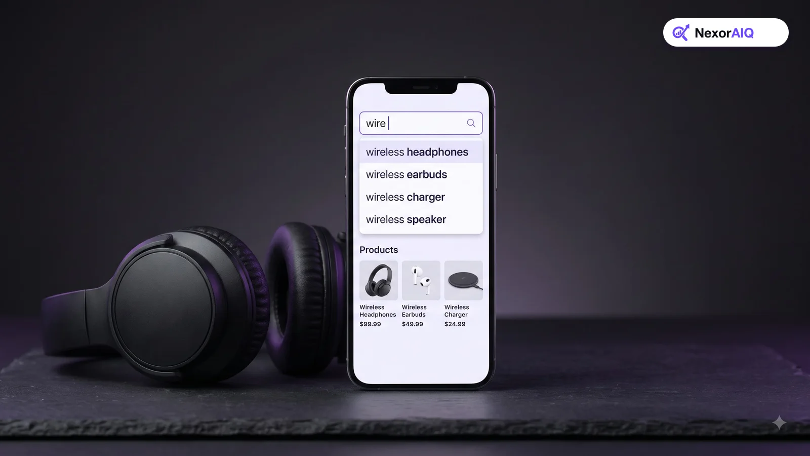
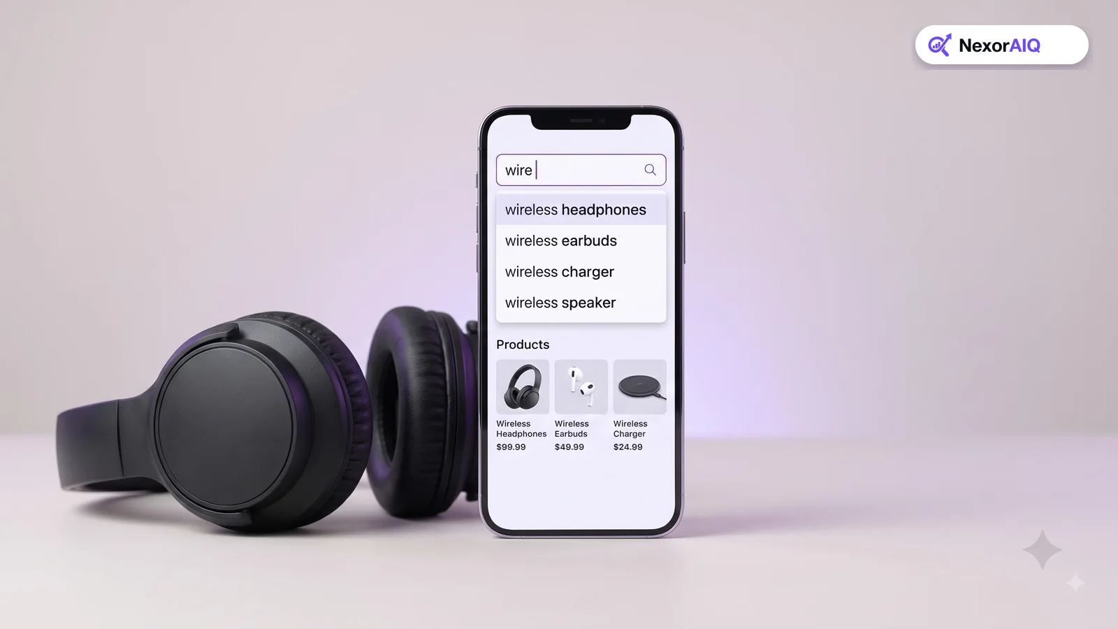
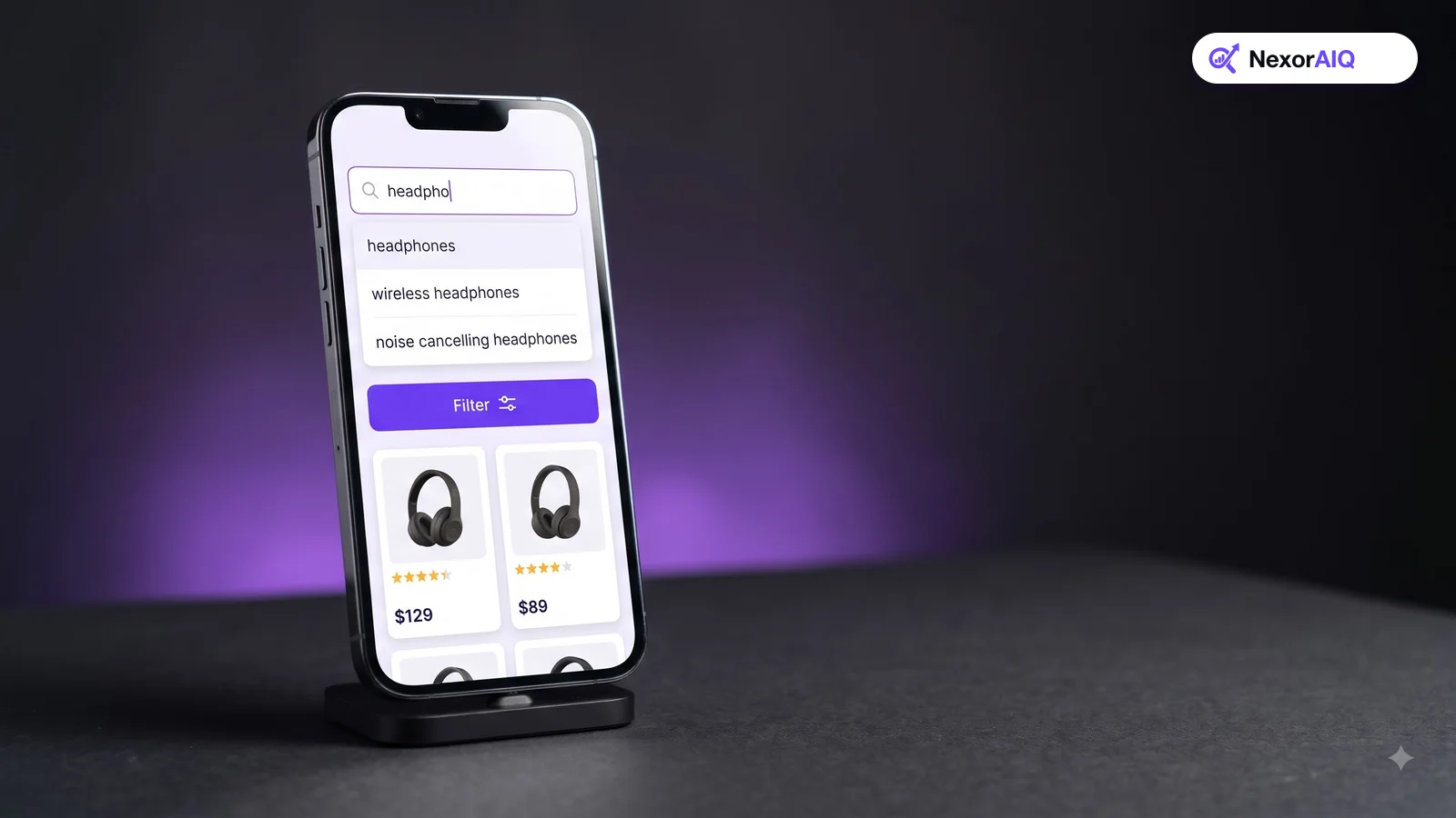
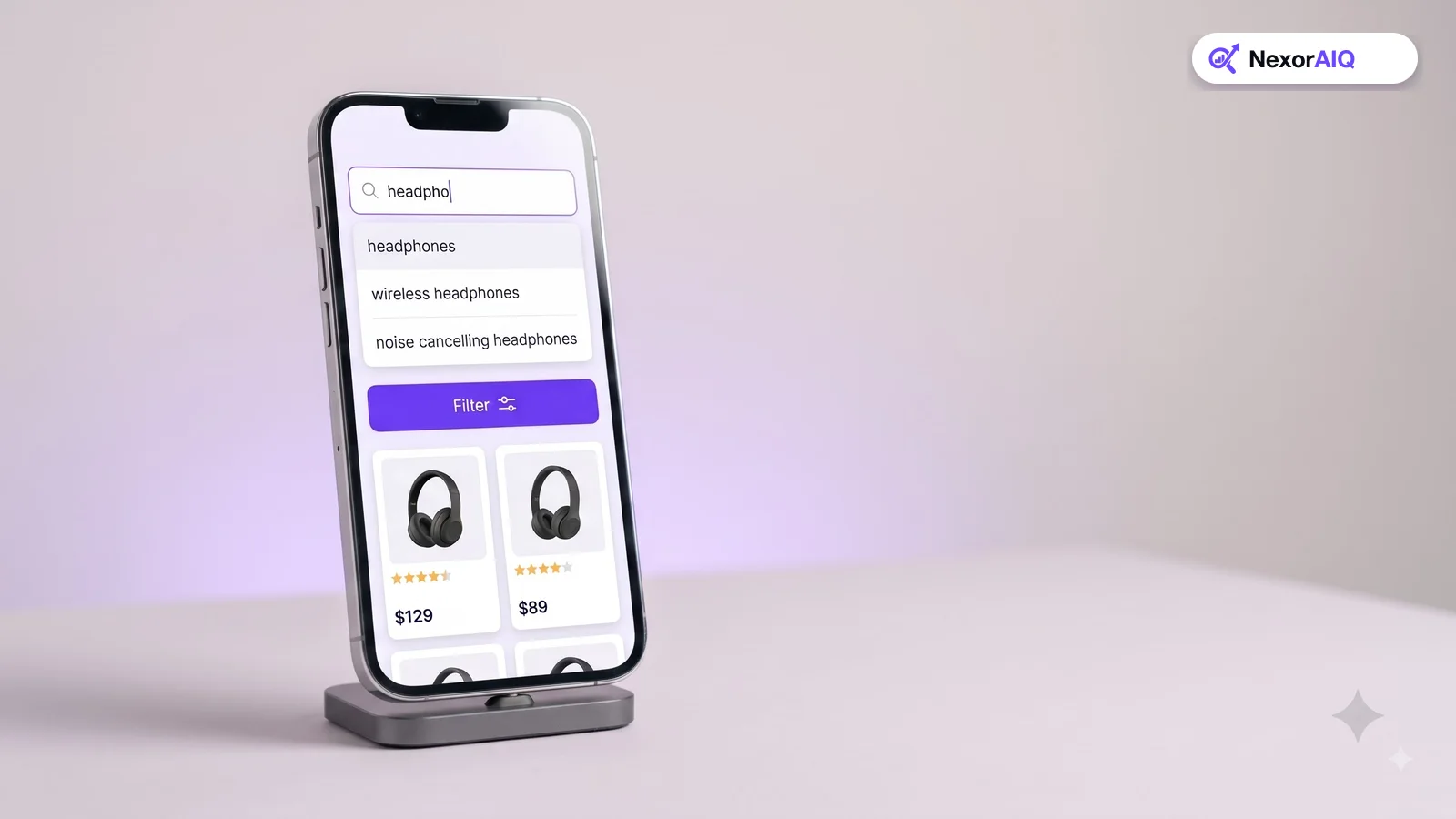
Typing is the hardest part of mobile search, so every keystroke saved counts. Show suggestions as soon as the shopper starts typing, and make each suggestion large enough to tap easily.
Keep the list short (six to eight suggestions) so it fits above the keyboard. Mix query suggestions with a few product suggestions with thumbnails. Our autocomplete best practices go into more detail.
5. Tolerate typos generously
Shoppers make more typing mistakes on phones. Search should return useful results for "headphnes", "addidas" and "shoes for runing" without making the shopper retype. Our search dictionary guide explains typo tolerance and synonyms.
6. Show recent and trending searches when the field is empty
When a shopper taps an empty search field, show their recent searches and a few popular searches. Returning shoppers can repeat a search in one tap, and new shoppers get ideas. Let shoppers clear their recent searches easily.
7. Design results for small screens
Results pages carry most of the decision-making, so make them easy to scan:
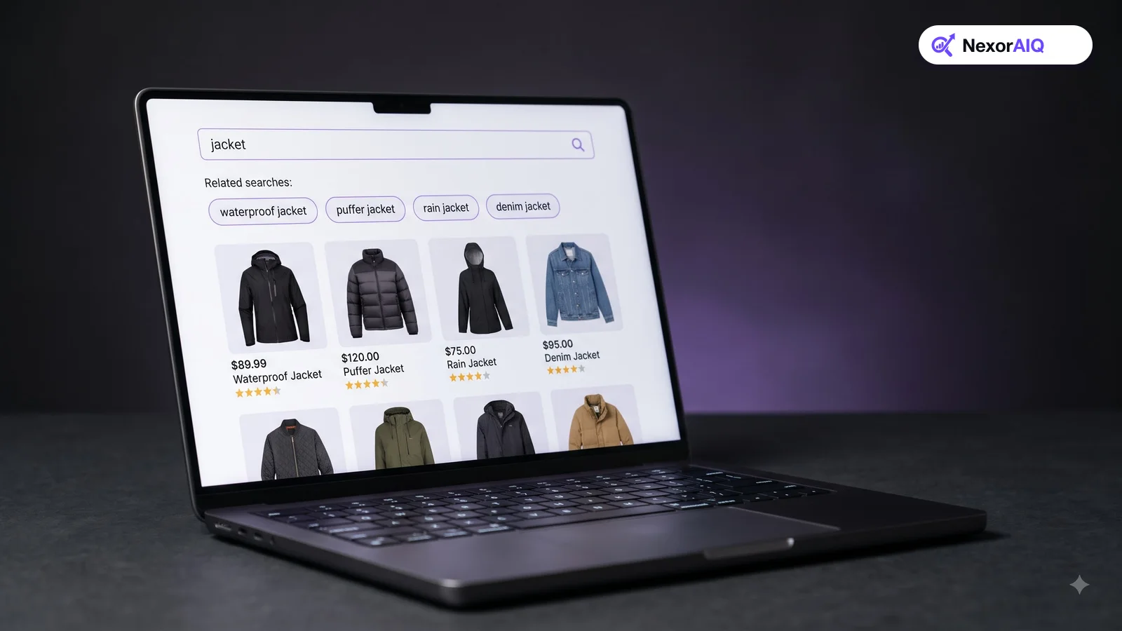
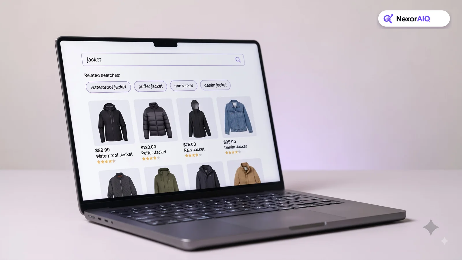
- Use large product images. Two products per row is usually the right balance on phones.
- Show the information shoppers compare: price, key attribute (such as color count or size range) and rating.
- Show the number of results and the original query, so shoppers know what they're looking at.
- Avoid banners that push products below the first screen.
8. Put filters and sorting one tap away
On mobile, filters usually live in a slide-up panel. Make sure:
- "Filter" and "Sort" buttons are always visible, ideally sticky at the top or bottom.
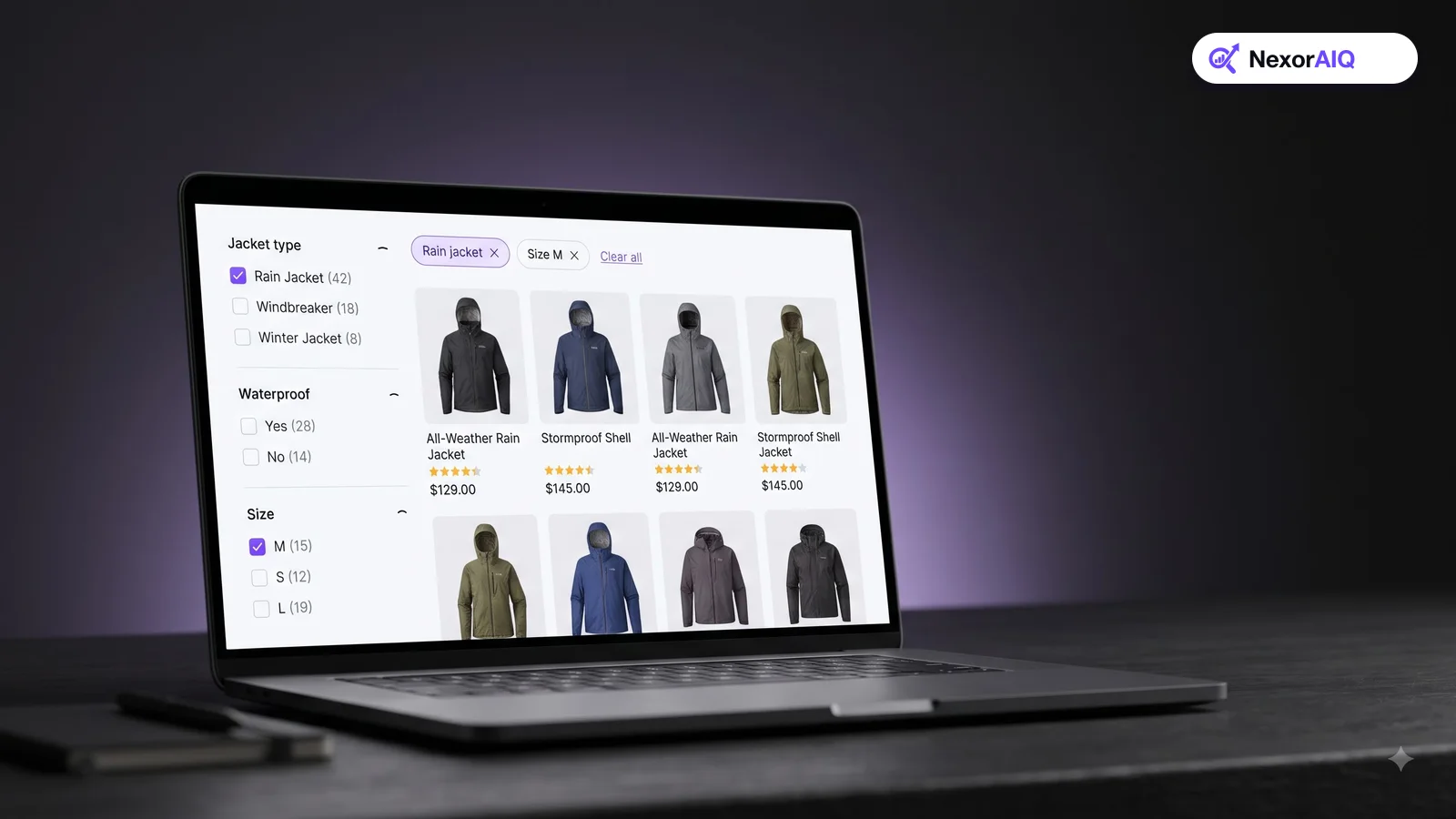
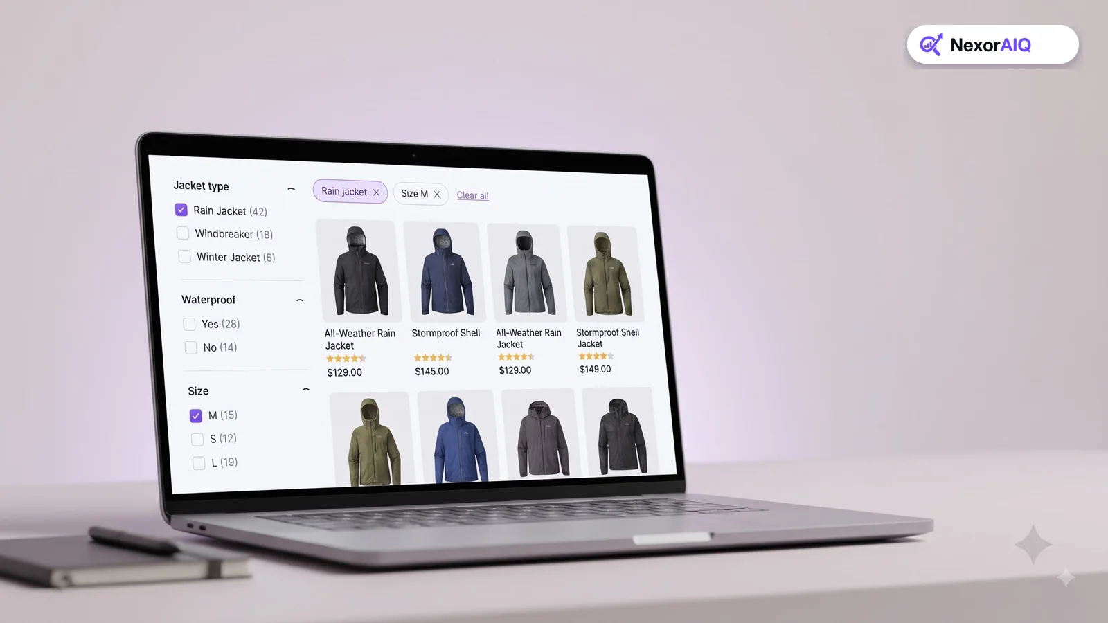
- Applied filters appear as chips that can be removed with one tap.
- The panel shows how many results each option will return.
- Filters match the product type being searched.
Baymard has also found that 94% of mobile sites don't let shoppers search within their current category. Offering that option helps shoppers narrow down large categories quickly. See our faceted search best practices.
9. Never show an empty no-results page
A blank "No results found" page on a phone usually ends the visit. Instead, show a corrected spelling, related categories and popular products, and keep the search field filled in so the shopper can edit their query. Our zero-result recovery guide shows what to include.
10. Make search fast on real mobile networks
Mobile shoppers are often on slower connections. Suggestions should appear while the shopper is still typing, and results should load without a long spinner.
- Keep search responses fast at the server, ideally well under 100 ms.
- Load product images lazily and in modern formats such as WebP or AVIF.
- Test on a mid-range phone on a throttled connection, not only on office Wi-Fi.
Where NexorAIQ fits
NexorAIQ's AI autocomplete shows suggestions and products from the first keystrokes, trending searches fill the empty search state, and no-result recovery keeps shoppers moving when a query doesn't match. In our production data, 95% of searches return in under 25 ms, which keeps search responsive on mobile networks.
NexorAIQ is available now for Magento 2 and Adobe Commerce.
Mobile search quick audit
| Check | Pass if |
|---|---|
| Search field | Visible at the top without tapping an icon |
| Submit button | Present next to the field |
| Auto-correct | Turned off on the search field |
| Autocomplete | Appears within 1–2 characters, with large tap targets |
| Empty state | Shows recent and trending searches |
| Filters | Sticky Filter/Sort buttons and removable chips |
| No results | Suggestions instead of a blank page |
| Speed | Results feel instant on a throttled mobile connection |
Frequently Asked Questions & Architecture Insights
Why is mobile ecommerce search harder than desktop?
Typing is slower and more error-prone, screens show fewer results, and filter panels take more taps. Mobile search needs larger tap targets, stronger autocomplete and better typo handling.
Should the search bar be visible on mobile?
Yes, if search is a main way shoppers find products. A visible search field at the top of the page gets used more than a search icon.
Should I disable auto-correct on the search field?
Yes. Phone auto-correct doesn't know your brand names and model numbers and often changes them into wrong words. Let your search engine handle typos.
How many products should show per row on mobile?
Two products per row is usually the best balance between image size and the number of products a shopper can compare at once.
Key Takeaway
Mobile is where most shoppers search now, and small details decide whether they find a product or leave. Make the field visible, reduce typing with autocomplete and typo tolerance, design results and filters for thumbs, and keep search fast on real networks. Test every change on an actual phone.